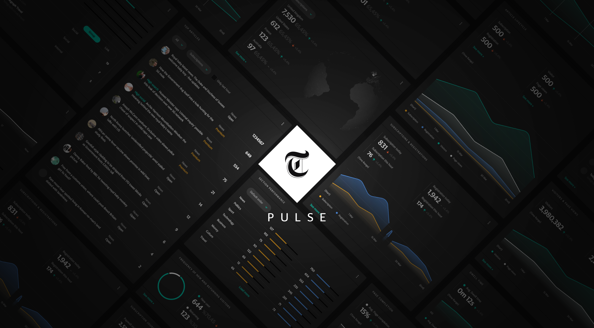
Figures in the visuals are purely illustrative.
The reporting available to the newsroom previously had many flaws; it was fragmented, with multiple tools providing different answers based on differing, sometimes contradicting metrics. To respond to data in real-time, Telegraph needed a broad overview with drill-down capabilities allowing editors and journalist to zero-in on a specific data point and further inspect it for deeper insights.
The design process we used goes through the following four main steps
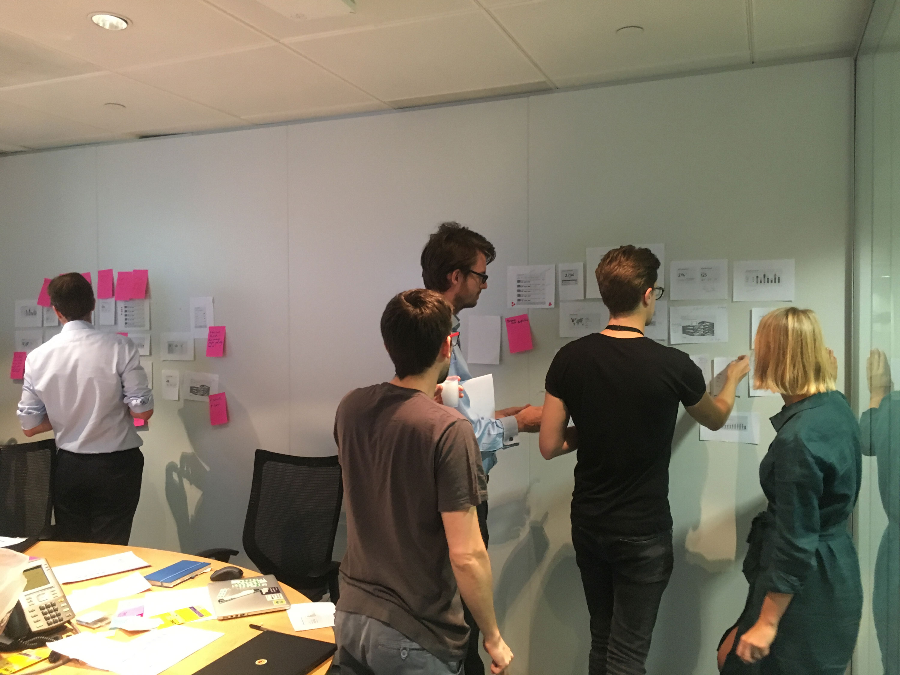
1. Start with the user
I have spent a reasonable amount of time shadowing and talking to the people who will be using Pulse. To understand what their current tools are, how they organise their workspace, what their frustrations are, and what they’d like to improve. Also involving users (editors, journalist) in the design ideation brought a huge amount of knowledge to the table and they naturally transition towards the new dashboard I am designing for them.
2. Establish relevant KPIs
Once understood what the user is trying to achieve, we figured out what metrics can we deliver that will be meaningful to that particular user. We looked into trends to enable strategic decision-making.
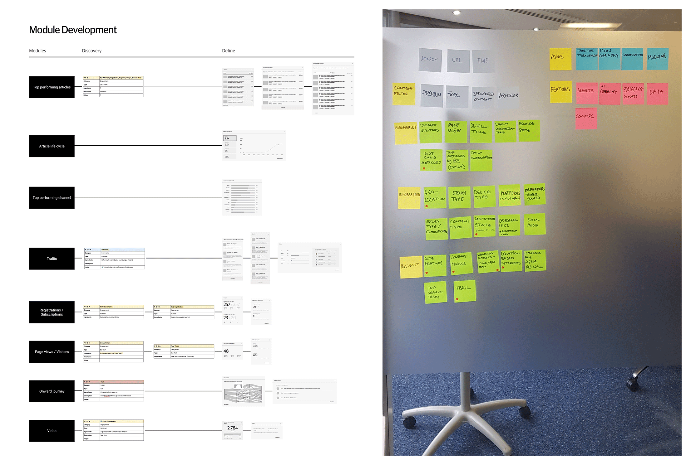
3. Choose effective data viz. methods
Once we know what information we are presenting and whom we are presenting it to, we started figuring out how, which in other words is the best way to display the data.
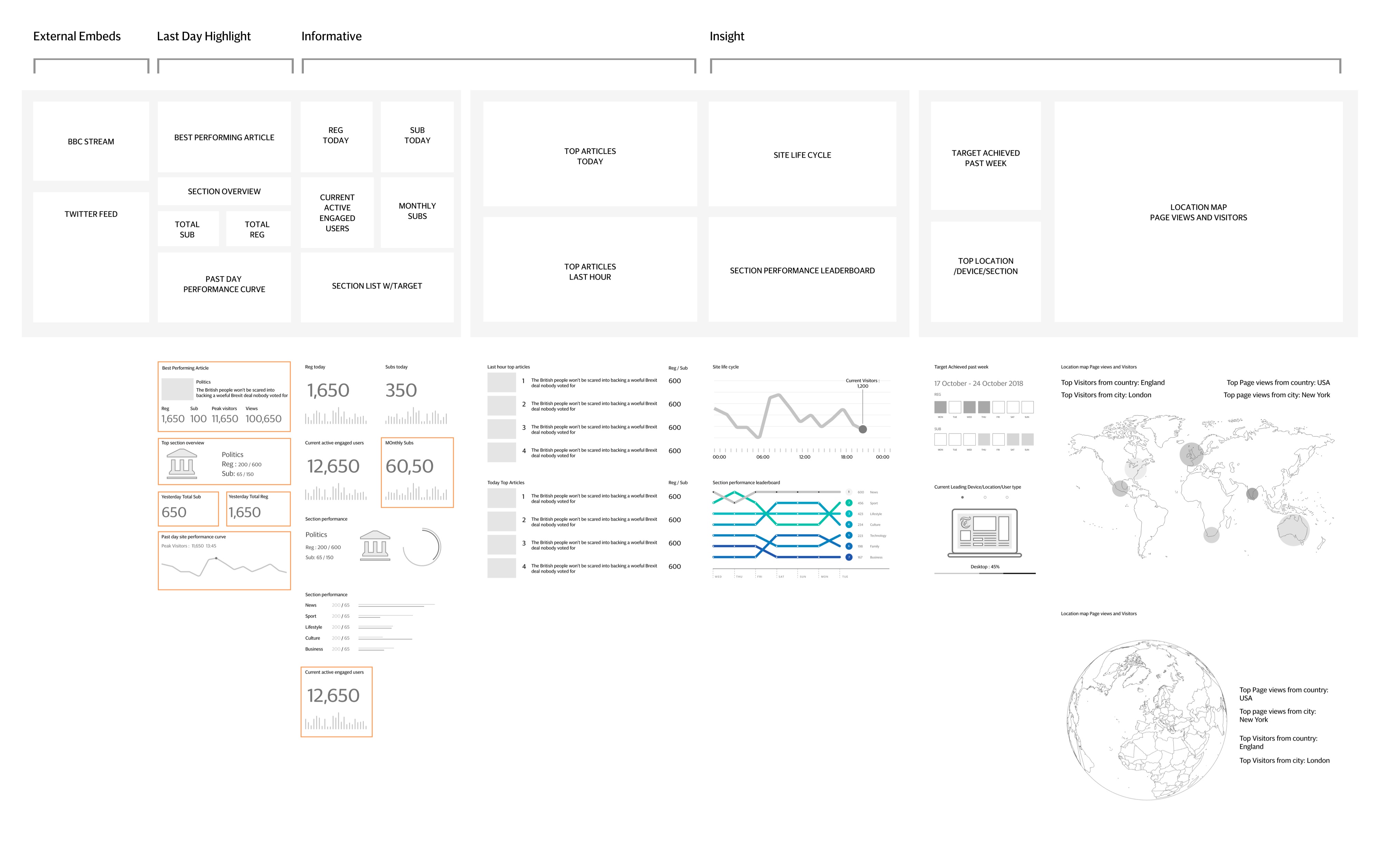
Our key dashboard design principles
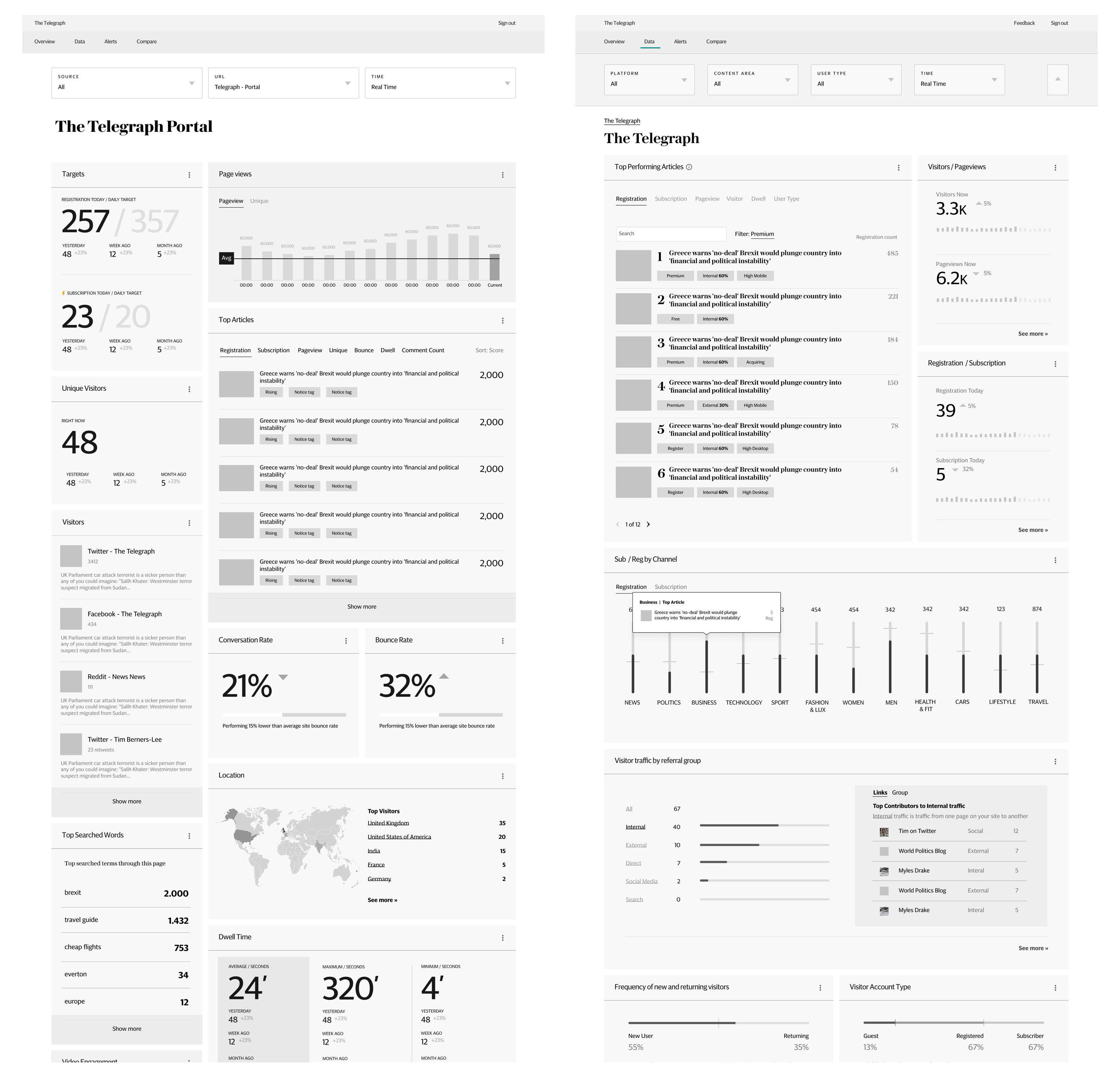
Display information in a logical layout: The story of our dashboard follows the same internal logic: the most significant high-level insights are displayed at the left, additional(secondary) insights on the right, higher granularity details that you can drill into and explore further on hover state or 2nd level pages of the modules.
Use the right data visualisation: We have selected the appropriate type of data visualisation according to which type of info we are trying to rely.
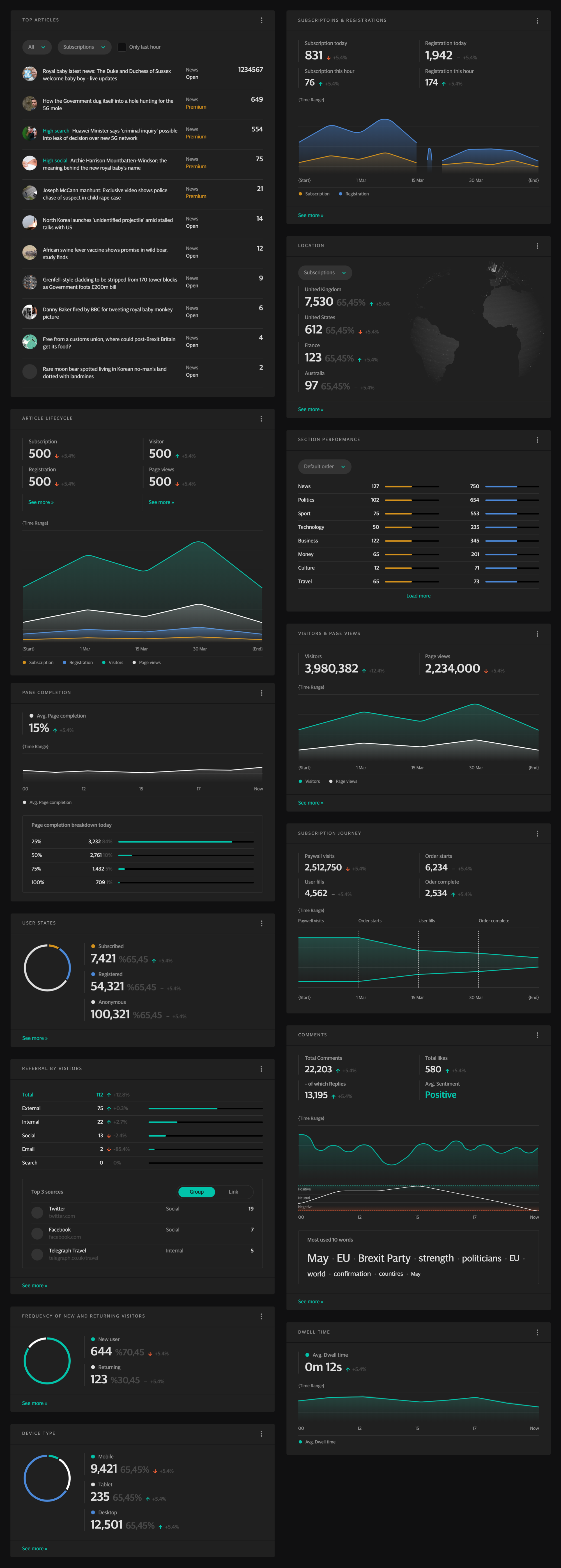
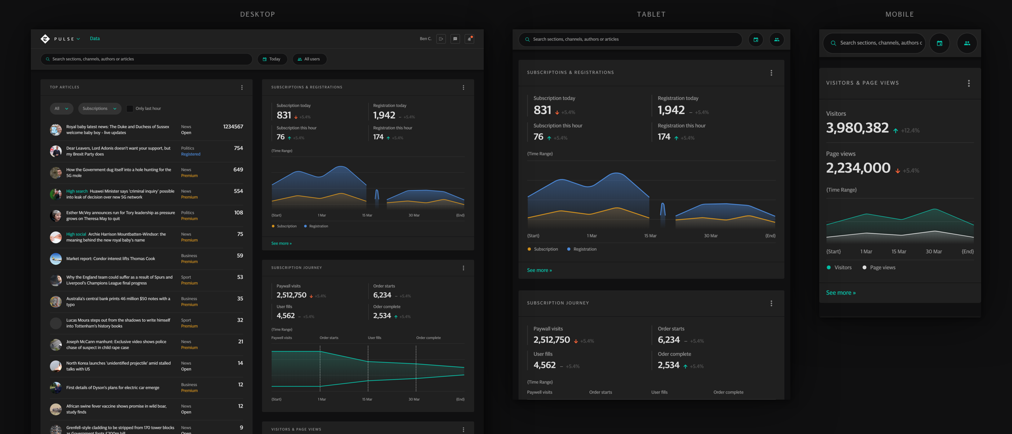
Flexible design to react quickly to changes: We designed the structure of the interface flexible enough to accommodate a dense amount of information. Information can always change, so it’s essential to think about building a product that’s easy to adapt to quickly to external needs and opportunities.
Aftermath
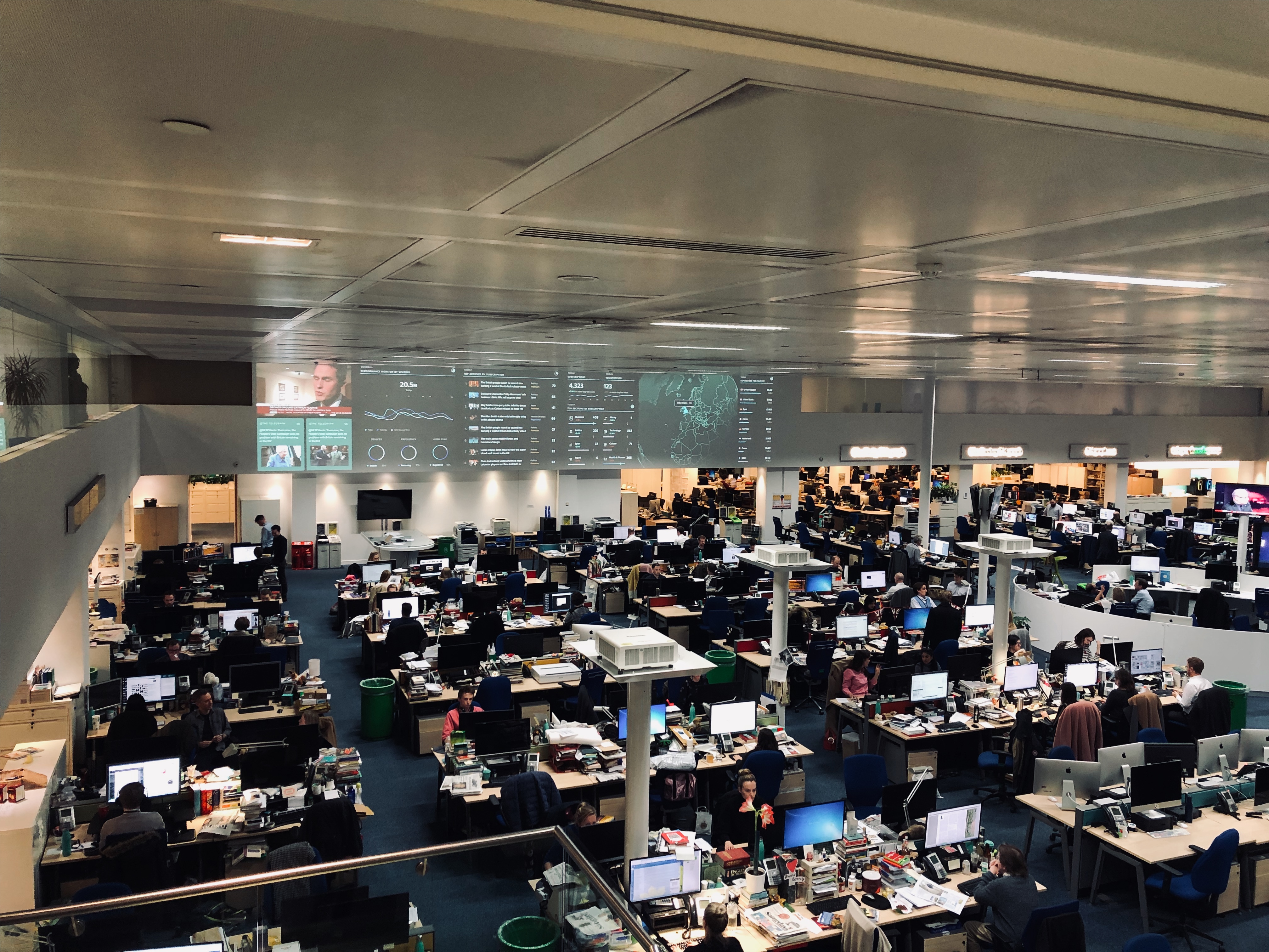
After an almost year-long effort, Pulse went live as planned in March 2019. It is now a key tool frequently used by Telegraphs journalists. After Launching Pulse, I have also delivered Pulse XL and replaced the old editorial dashboard. Providing visual support on the heart of the newsroom. These two projects changed Telegraphs attitude to the data, which enabled them to increase subscriber acquisition.
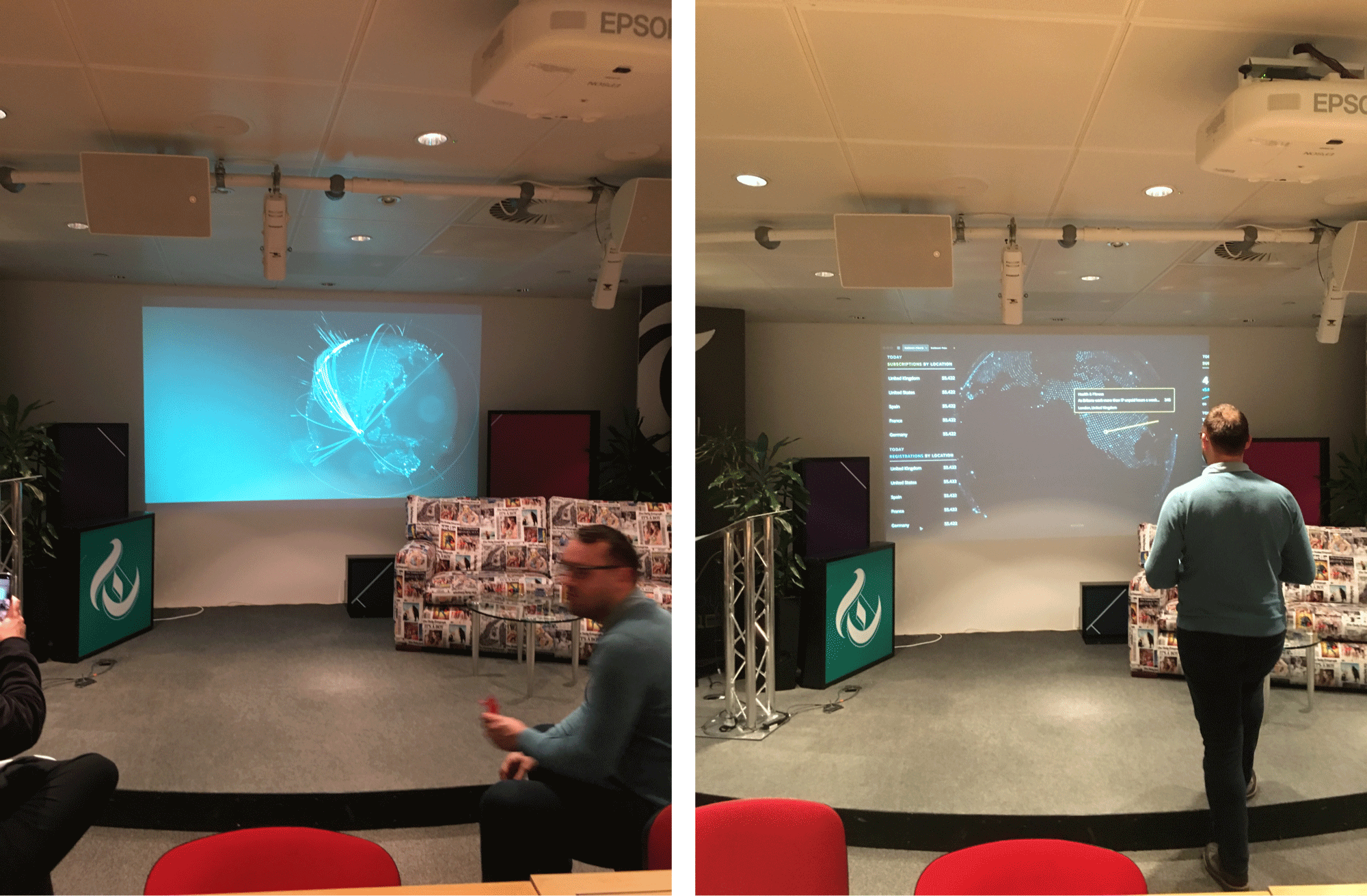
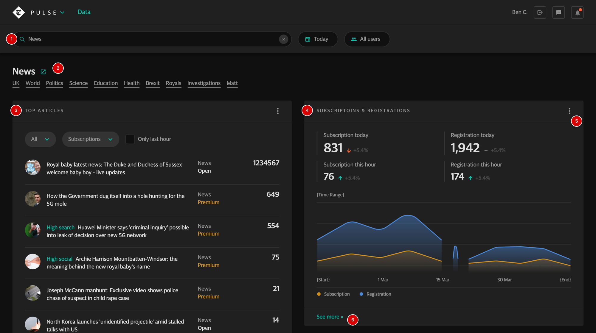
Pulse XL